Mastering Bright Colors in Photography from Capture to Edit

Introduction
Color is one of the fastest ways to grab a viewer’s attention! Bright, bold hues in particular can transform an ordinary scene into something eye-catching and unforgettable. However, vibrant colors can also be deceptively tricky. Often, images can appear artificial or oversaturated; if you play it too safe, your colors won’t have the impact you intended.
In this post, I’m breaking down exactly how to approach color with flowers photography.
The goal? Make your colors pop without ever crossing that line into “too much.”
Planning Your Shot with Color in Mind
A great color photo doesn’t happen by accident—it starts with intention.
Nature is a goldmine: flowers, birds, leaves, and fruit offer an incredible array of natural colors.
Think about the basics of color theory. Complementary colors (such as blue and orange, or red and green) create an instant pop by playing off each other. Analogous colors, such as pinks, reds, and oranges, create a softer, more harmonious look. Think about what mood you’re aiming for. Colors can help tell a story, create a mood, and bring the image to life.
Lighting is everything for bright colors. Early morning and late afternoon (golden hour) light adds warmth and richness. Midday sun? It can make your colors oversaturated and way too bright. I try to get out early in the spring and summer so I can capture the rich colors and ensure they stay true.
If you’re stuck shooting in direct sunlight, look for shade or filtered light to protect your colors, or use a diffuser.
Finally, simplify your backgrounds. A vibrant flower on a cluttered backdrop won’t have the same punch as when it’s isolated against a muted or contrasting color. Scan your scene for distractions before you press the shutter.
Camera Settings and Techniques for Vibrant Color
Nailing color in-camera is the foundation of a great shot. Here’s where to focus:
Shoot in RAW. JPEG files limit your editing options and compress color data. RAW gives you full control in post.
Dial in white balance. Bright colors can quickly become skewed by poor white balance. Use a custom setting or set it manually to maintain colors that are true to life. I often use auto, but with bright colors will try other settings to get the color correct.
Avoid blown highlights. Overexposure can destroy detail, especially in bright colors such as reds, yellows, and whites. Check your histogram and adjust the exposure slightly if needed. Underexposing is your best tool for those bright reds, meganetas.
Use a polarizer. A circular polarizing filter can reduce reflections and boost saturation, especially in skies, water, and foliage.
Focus and depth of field. Crisp, sharp details enhance the impact of color, so ensure your focus is spot-on and use appropriate aperture settings to control depth of field. For bright colors, they often look better with less detail, so shooting with a low f-number, or even using a creative lens, such as a Lensbaby, can be beneficial.
Composition Tips to Make Color Pop
Color isn't just a component of your photo—it can be the subject itself.
Use negative space liberally. Isolating a single vibrant subject against a clean background lets it breathe and draws immediate focus. Bold color against neutral tones is a timeless combo.
Consider layering for depth. Placing colorful elements at different distances from your lens—foreground, midground, and background—adds dimension and richness.
For more drama, work with leading lines and frames.
Editing Bright Colors—Dos and Don'ts
This is where the magic—and the mistakes—often happen.
Start with global edits:
Correct white balance and exposure first. Use the temperature and tint sliders to adjust your white balance to impact the colors.
Use the HSL (Hue, Saturation, Luminance) sliders to tweak individual colors. Want to make blues deeper without touching reds? HSL is your friend.
Use a color range mask for very selective color changes
Boost vibrance before saturation. Vibrance enhances midtones and tends to avoid making colors overdone.
Local adjustments are key if only part of your image needs a color boost or tone-down. Use radial or linear masks to selectively adjust areas without affecting the whole shot.
A few critical don’ts:
Don’t crank saturation across the board—it’s the fastest route to an unnatural look.
Don’t ignore neutral colors—sometimes toning down surrounding colors can enhance the vibrancy of your main subject.
Don’t over-sharpen; too much clarity can kill the smoothness of bright colors.
Take breaks during editing. Coming back fresh helps you catch overdone spots you might have missed.
Advanced Editing Techniques
When you’re ready to level up, dig into these:
Masking and adjustment layers: Tools like Lightroom’s masks or Photoshop’s layers allow you to control exactly where your edits are applied.
Curves: Adjust individual color channels (Red, Green, Blue) to fine-tune the balance and depth of specific colors.
Color grading: Split toning and LUTs (look-up tables) enable you to apply creative moods and stylized tones that can make colors appear cinematic or dreamy.
Sharpening: Apply selectively. Sharpening enhances detail, but excessive sharpening can make colors appear noisy or harsh.
Aim for control and precision rather than heavy-handed effects.
Common Mistakes to Avoid
It’s easy to go overboard with bright colors. Watch out for:
Over-saturation: If your colors look cartoonish or glow unnaturally, you’ve pushed too far.
Color clipping: Check histograms and previews—once color channels clip (hit 100% intensity), detail is lost.
Monitor issues: Editing on an uncalibrated monitor? Colors may look wildly different on other screens. Calibrate regularly. You can check your image on another device to see if it is too bright.
Real-World Examples

This is the original image. The green and the red are a nice combination. However, the colors are a bit too saturated and harsh for the type of images I prefer in my portfolio. With a few edits, we can achieve a softer, more natural look.
I started with the Saturation Color Mixer. I reduced the red, aqua and the blue channels. Then I went to the Hue Channel. The Red Hue is made up of Magenta and Orange. I moved the slider away from the magenta to reduce that in the color panel.
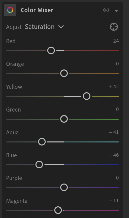

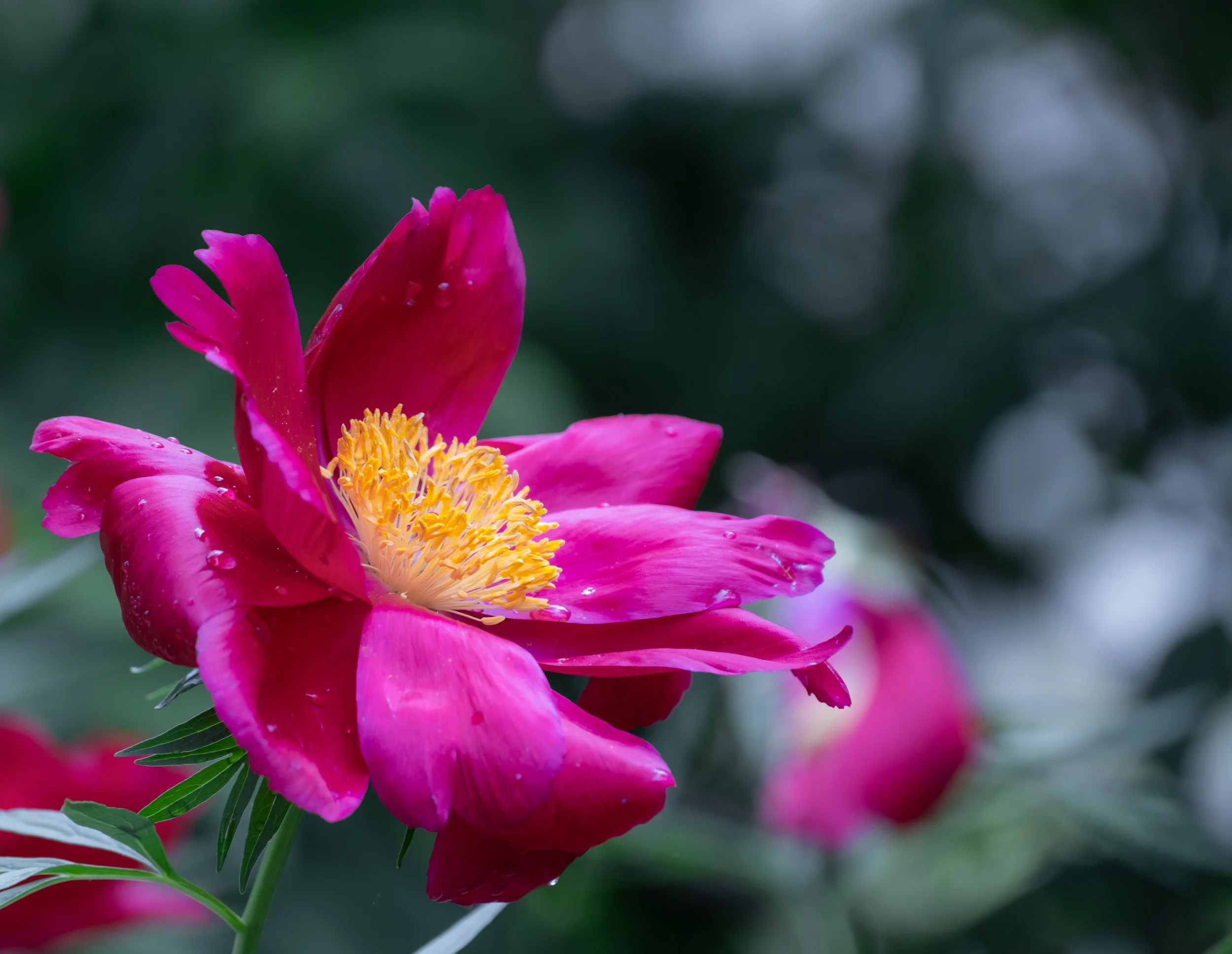
After editing the color panels, I reduced the clarity of the overall image to give it a softer appearance. I find the color changes to be more accurate and pleasing to the eye.
Conclusion
Bright colors are bold, but using them well requires finesse. From planning your shot to the final export, every step matters when you want your colors to sing without shouting. Stay intentional, aim for balance, and don’t be afraid to experiment. For most images, I do not adjust the HUE slider, but for harsh reds and magentas, it helps to modify the hue.
Have a question—or a vibrant photo to show off? Please send me an email or message on Instagram!